- Aug 24
- By Drexey
Some mornings, blue feels right before you can explain why. On other days, you want a red ring that enters the room a second before you do. And sometimes, the only thing that makes sense is a clean line of white light around your wrist.
That is the part of color psychology we find most interesting—not the idea that one color can reveal your entire personality, but the way color can help you express the version of yourself you want to bring forward today.
Color can change the energy of an outfit, draw attention to a gesture, or become a small visual reminder of how you want to feel. Jewelry makes that effect especially personal because it moves with you and stays close to the body. A gemstone is not just seen across the room. You catch it while reaching for coffee, typing an email, or turning your hand in the sun.
So instead of asking, “What does my favorite color say about me?” try a more useful question:
What do I want my color to do for me today?
Color psychology is a starting point, not a personality test
We often hear that red means confidence, blue means calm, and green means balance. There is some truth behind these shared associations, but color is more personal than a fixed chart.
Research on color and psychological functioning suggests that color can influence emotion, attention, and perception, while the situation around the color matters just as much. A large study across 30 countries also found common patterns in how people connect colors and emotions, alongside differences shaped by language and geography.
In other words, a color may carry a familiar mood, but your history with it still matters. The blue of a childhood swimming pool will not feel exactly like the blue of a school uniform. A green that reminds one person of new leaves might remind someone else of a city they once lived in.
That is why choosing gemstone jewelry by color should feel less like following a rule and more like recognizing yourself.
Red and hot pink: when you want to be fully seen
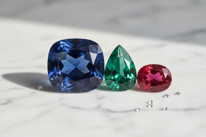
Red rarely sits quietly. It has long been connected with love, heat, courage, and intensity. Hot pink carries some of that same energy, but with more playfulness and less ceremony. Both colors work when you want your jewelry to feel intentional rather than simply decorative.
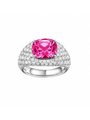
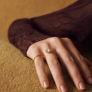
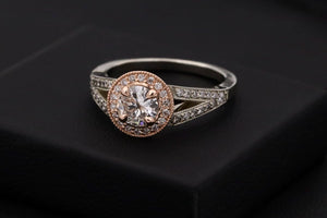
This is where ORBE feels at home. Its cushion-cut center stone is framed by rows of pavé and a rounded, substantial silhouette. In ruby or hot pink sapphire, the color is not a small accent—it becomes the center of gravity for the whole look.
Wear it when the outfit is simple but you do not want to disappear into it: a white shirt, a black dress, denim, or the sweater you have worn a hundred times. ORBE adds the sentence the clothes leave unfinished.
Choose red when: you want focus, conviction, and a
little drama.
Choose hot pink when: you want confidence that still
feels spontaneous.
Canary yellow and sunrise tones: wearable optimism
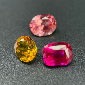
Yellow is often associated with sunlight, warmth, and forward motion. It feels open. A clear canary yellow gemstone can brighten neutrals without making an outfit feel overly sweet, especially when the stone has a precise cut and a modern setting.
Sunrise Padparadscha sits somewhere between pink, peach, and orange. Because it refuses to stay inside one easy color category, it feels more atmospheric—like the light changing rather than a single flat hue. It is a good choice for someone who loves warmth but wants more nuance than classic yellow or pink.
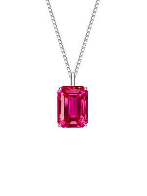
On ORBE, these colors become bold and sculptural. On the MAREA radiant-cut necklace, they read differently: one concentrated flash of warmth at the neckline, easy with a T-shirt, slip dress, or open collar.
Choose canary yellow when: you want energy that
feels clean and direct.
Choose Sunrise Padparadscha when: you want warmth with
softness and complexity.

Blue and Paraiba hues: space, clarity, and a reset
Blue is one of the most widely liked color families, but “blue” is never just one mood.
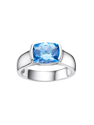
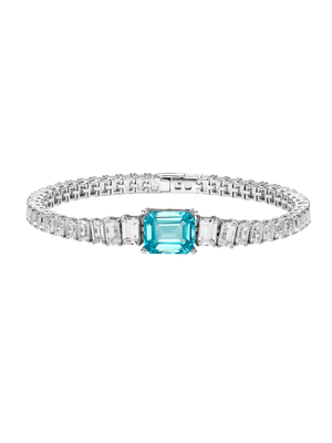
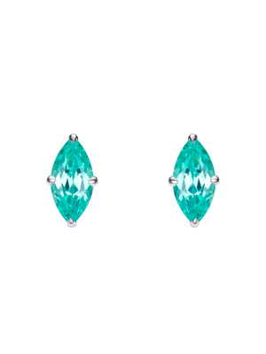
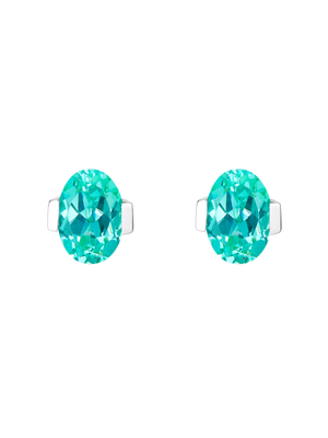
Royal blue is deep and composed. It has presence without the heat of red, which makes it feel polished and self-assured. Santa Maria blue is lighter and airier, closer to open water and clear sky. Paraiba blue leans more electric, where blue meets green; it feels fresh, vivid, and slightly unexpected.
Color-preference research has proposed that we often respond to colors through the things and experiences we associate with them. That helps explain why water-like blues can feel restorative while saturated blue can feel powerful and formal.
If you want that feeling close to you without building the entire outfit around it, MAREA works like a single clean note. Its radiant-cut center creates lively flashes from a streamlined solitaire setting. Choose a softer blue for breathing room, royal blue for composure, or Paraiba Hue YAG for a brighter, more energetic version of calm.
For more volume, ORBE turns royal blue or Paraiba blue into a full statement.
Choose royal blue when: you want calm with
authority.
Choose Santa Maria blue when: you want lightness and
ease.
Choose Paraiba blue when: you want freshness with an
electric edge.
Green and purple: grounded, but never predictable
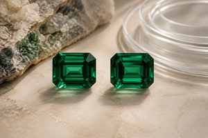
Green is closely tied to growth and the natural world, so it often feels balanced and restorative. In a gemstone, however, green can also be striking—especially when the color is vivid enough to stand against the skin.
Purple has a different kind of depth. It moves between cool blue and warm red, which gives it a more ambiguous personality. Depending on the light and the colors around it, purple can feel romantic, artistic, moody, or quietly unconventional.
MAREA lets both colors stay clean and modern. A Colombian emerald green center stone adds a strong point of color without making the necklace feel formal. Purple sapphire is an easy choice for someone drawn to color but less interested in the expected routes of red, blue, or pink.
Choose green when: you want renewal, steadiness, and
a connection to nature.
Choose purple when: you want something expressive that
is harder to define.

White sapphire: color can also be light
Not every color decision needs to be colorful.
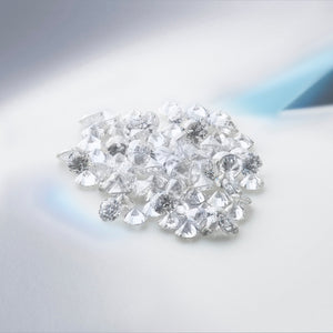
White sapphire is useful when you want brightness without assigning the jewelry a strong emotional direction. It reflects what is around it: the coolness of white metal, the warmth of yellow gold, the colors in your clothing, and the movement of natural light.
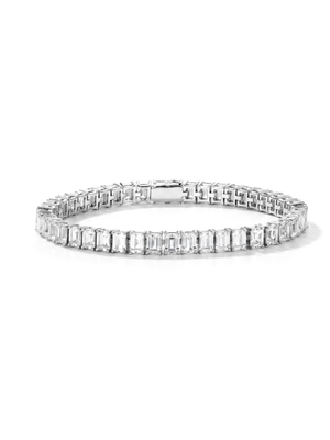
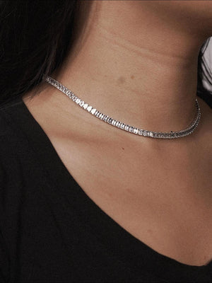
The LAGO emerald-cut lab-grown white sapphire tennis bracelet turns that idea into a continuous line. Its step-cut stones create broad, cool flashes rather than a rainbow-like sparkle. The articulated links sit close to the wrist, so the effect feels rhythmic and fluid instead of ornate.
LAGO is the piece for days when you want clarity, not quietness. Worn alone, it gives a clean look a sharper finish. Stacked beside a watch or colored bracelet, it becomes the line of light that holds everything together.
Choose white sapphire when: you want brightness, flexibility, and room for the rest of your look to speak.
First choose the color. Then choose its volume.
The same color can feel completely different depending on how you wear it. A small red pendant and a pavé-set red cocktail ring may share a hue, but they do not say the same thing.
Think of the setting as a volume control:
- ORBE is full volume. The domed pavé silhouette and large cushion-cut center make color the main event.
- MAREA is one clear note. A single radiant-cut gemstone brings color close to the neckline without taking over the outfit.
- LAGO is a continuous rhythm of light. The white sapphire line is easy to wear alone and easy to layer with other colors.
There is no “right” level. Some people want their jewelry to announce the mood; others want it to reveal itself only when the light catches it.
Do you need to match gemstone color to your skin tone?
Only if that way of choosing helps you.
Traditional styling advice divides people into warm and cool skin tones, then recommends yellow, orange, or green for one group and blue, purple, or pink for another. That can be a useful place to begin, but it is not a limit.
A gemstone can work through harmony or contrast. A warm stone may blend beautifully with warm undertones; a cool, saturated stone may stand out against them. Metal color changes the effect again. Yellow gold can warm up blue and green stones, while white metal can make their coolness feel sharper.
The better test is simple: put the color near your face or hand in natural light. Notice whether you keep looking at your skin—or at the stone. The right choice is usually the one you want to look at again.
A simple way to find your color
If you are stuck between several gemstone colors, do not ask which one is the most versatile. Ask these three questions:
- What colors do I already reach for? Look at your favorite coat, bag, nail color, or room—not only your jewelry box.
- Do I want harmony or contrast? A blue stone can echo a cool wardrobe, while a yellow or hot pink stone can interrupt it in a good way.
- How visible do I want the color to be? Choose ORBE for impact, MAREA for an everyday focal point, or LAGO when what you want most is light.
You do not have to choose a color for life. You can choose one for this chapter, this season, or this Tuesday.
The color does not define you. You define the color.
Color psychology can give us a language for talking about what we already feel. Red can help us name boldness. Blue can make space for calm. Yellow can remind us to move toward the light. But jewelry becomes personal only when those associations meet your own memories, style, and mood.
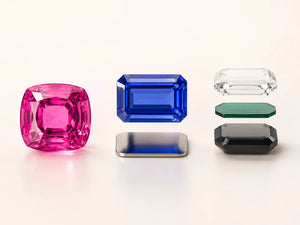
At Drexey, we do not think of color as an afterthought added to a design. It is the starting point. Our lab-grown gemstones make room for richer, more varied color choices, while each piece gives that color a different way to live on the body.
So, what color are you today?
Explore LAGO · Discover ORBE · Choose your MAREA color
Frequently Asked Questions
What is color psychology in jewelry?
Color psychology in jewelry looks at the emotions, memories, and visual associations a gemstone color may create. These meanings are not fixed: culture, context, and personal experience all shape how a color feels.
What gemstone color is best for everyday wear?
The best everyday color is one that works with your wardrobe and feels natural to repeat. White sapphire is highly flexible, blue and green can feel calm and grounded, while a single vivid pendant makes brighter colors easy to wear daily.
Can gemstone color affect your mood?
Color can influence attention, perception, and emotional associations, but it does not control mood in a universal or guaranteed way. A gemstone can work more like a personal cue—a small reminder of the energy or feeling you want to carry.
How do I choose between a ring, necklace, and bracelet for color?
Choose a ring when you want to see the color throughout the day, a necklace when you want one focused point near the face, and a bracelet when you prefer light and movement at the wrist.